
5 x 10
NINA MOLNAR & CHRISTINE SHAW
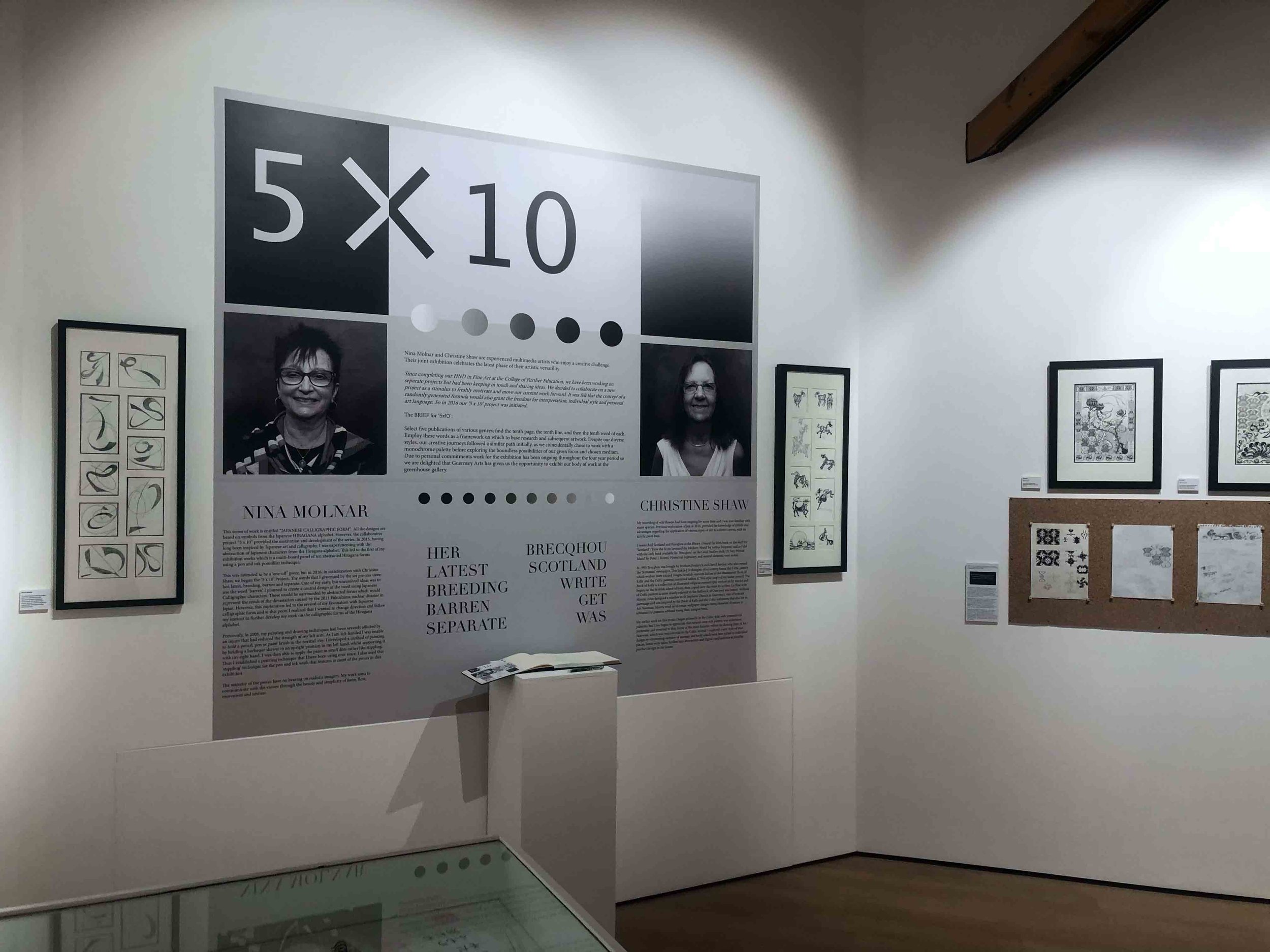
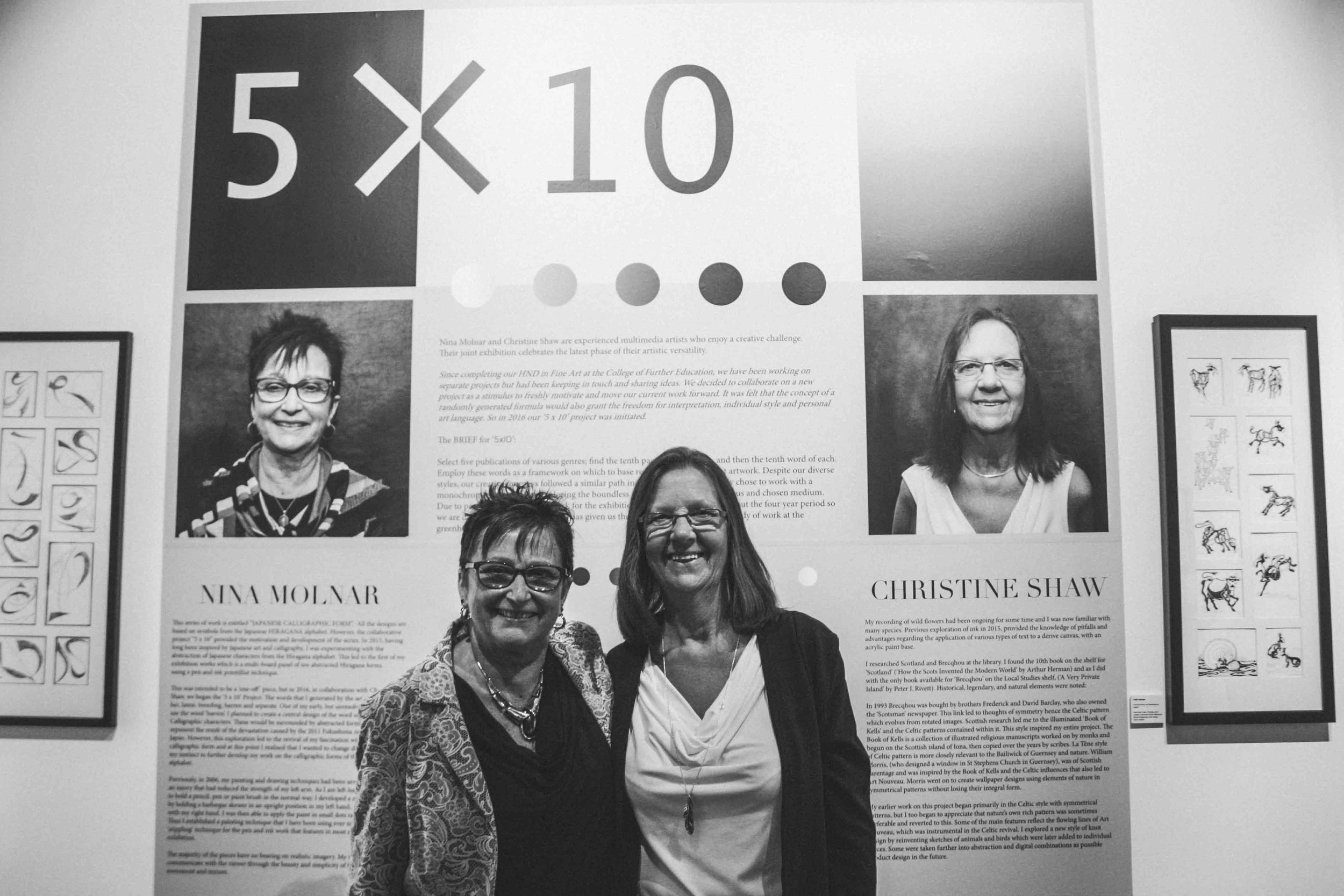
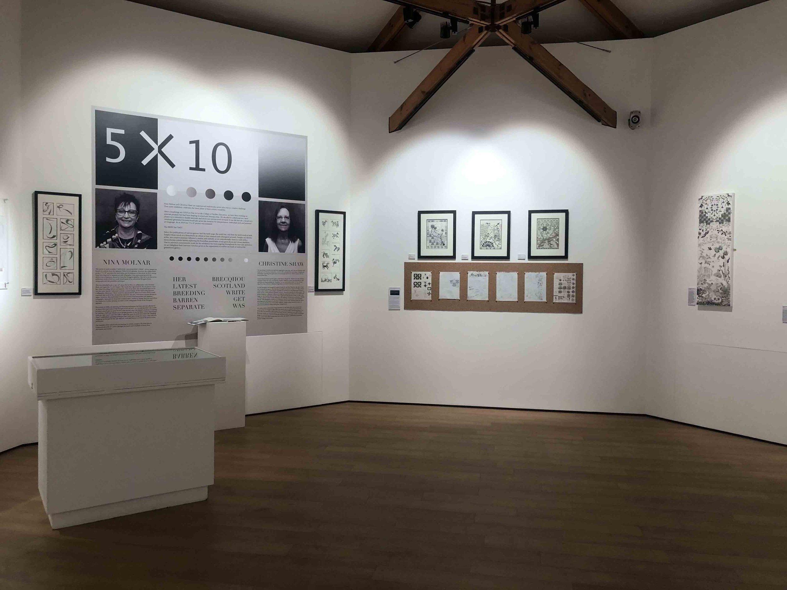
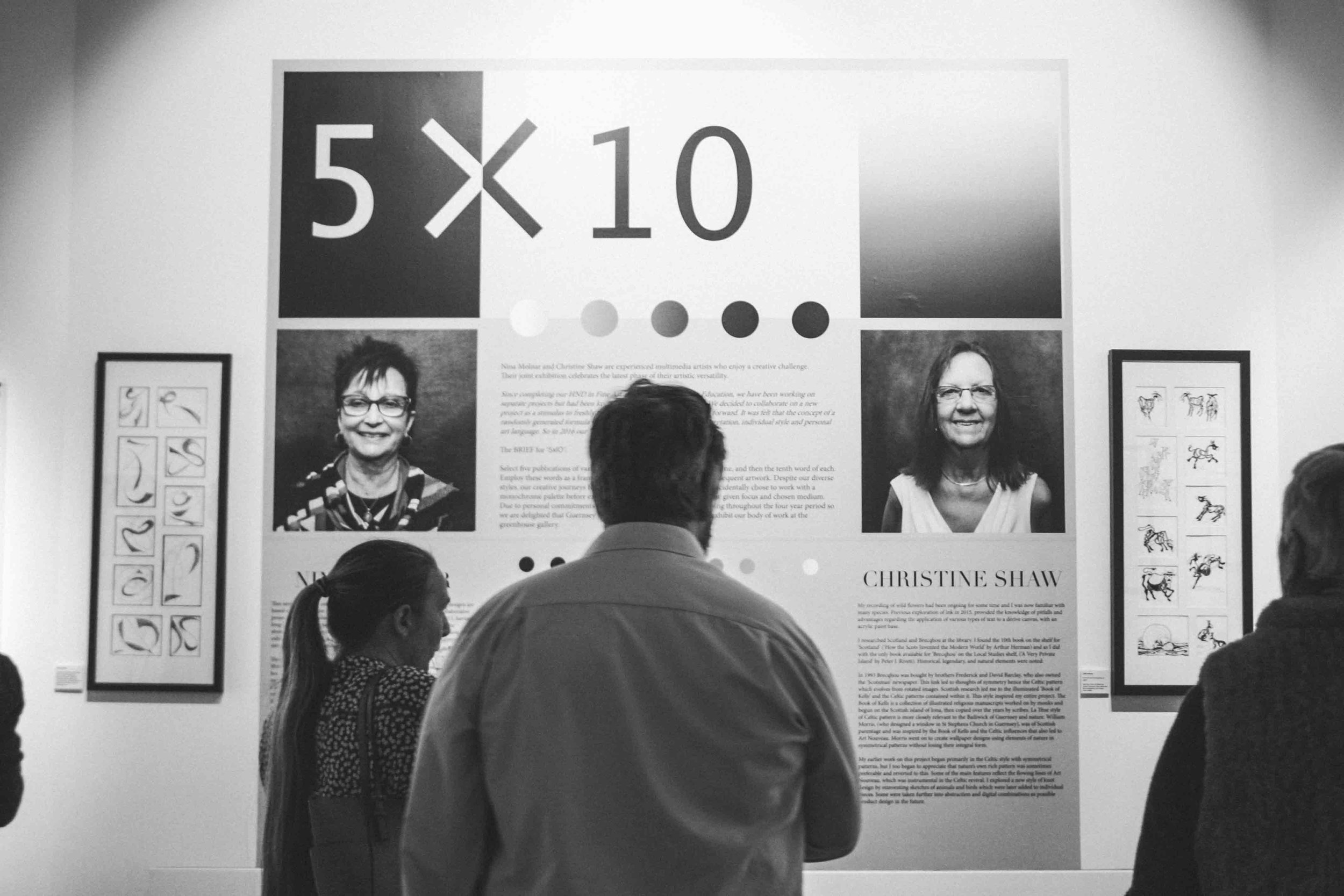
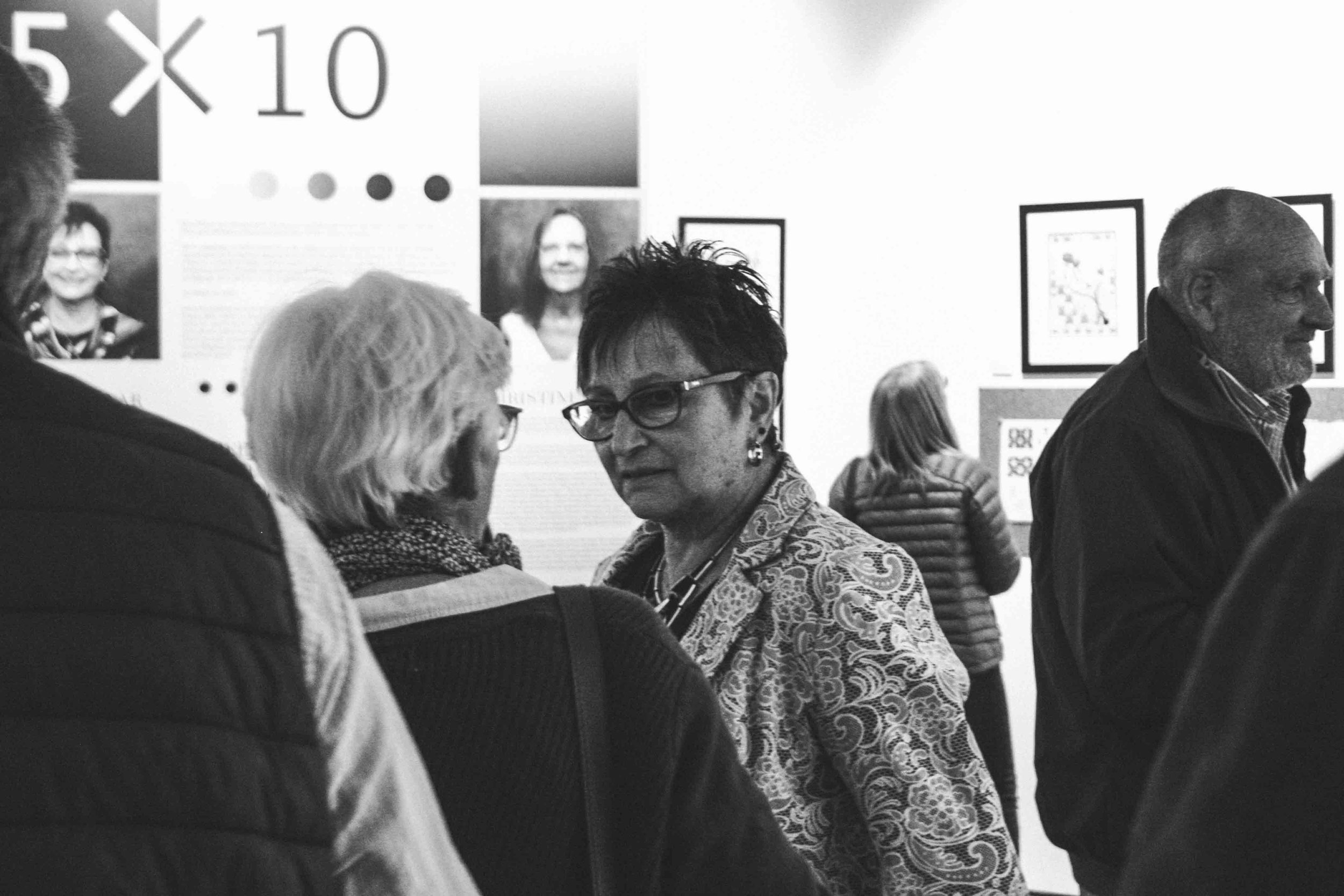
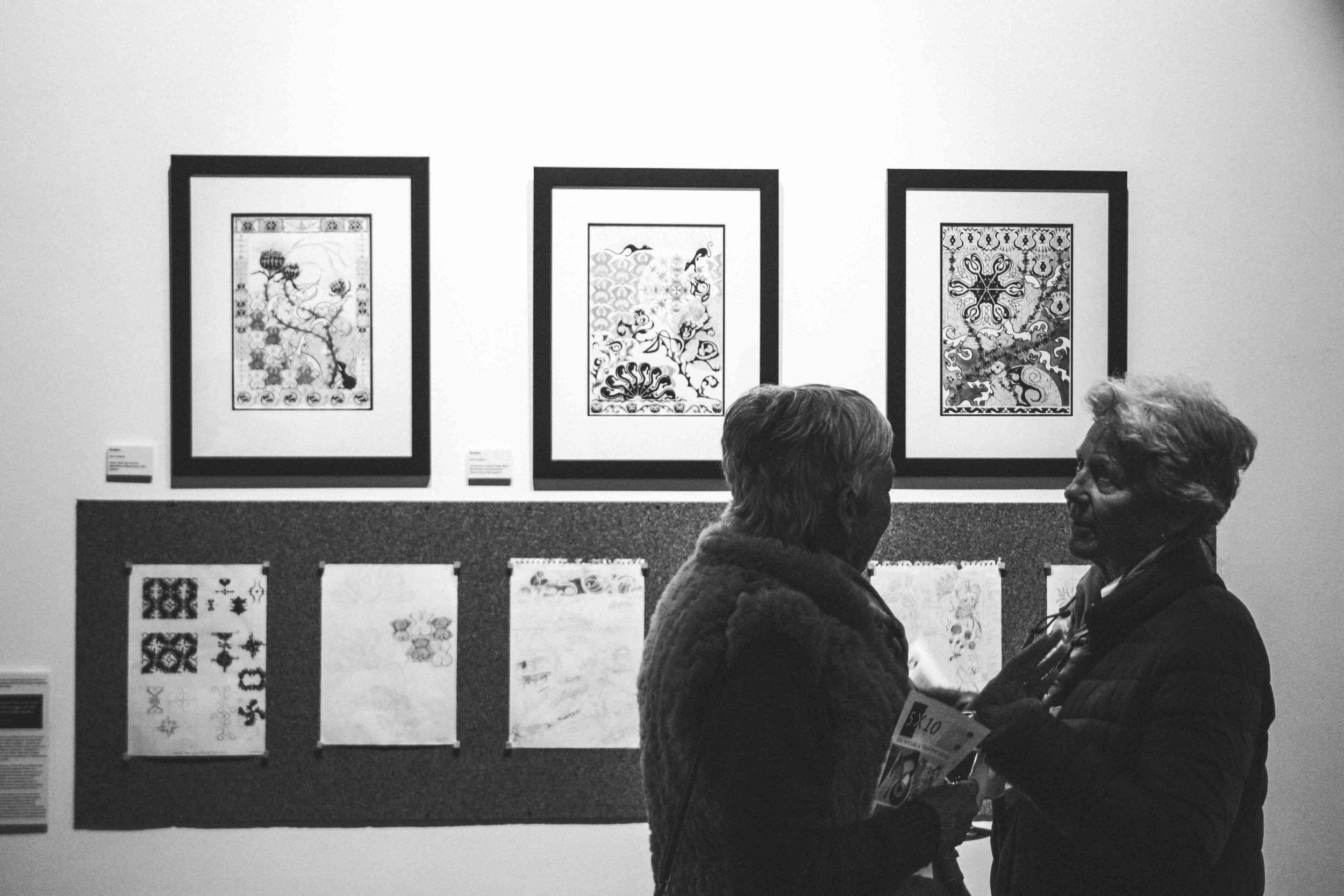
Nina Molnar and Christine Shaw are experienced multimedia artists who enjoy a creative challenge. Their joint exhibition celebrates the latest phase of their artistic versatility.
Since completing our HND in Fine Art at the College of Further Education, we have been working on separate projects but had been keeping in touch and sharing ideas. We decided to collaborate on a new project as a stimulus to freshly motivate and move our current work forward. It was felt that the concept of a randomly generated formula would also grant the freedom for interpretation, individual style and personal art language. So in 2016 our ‘5 x 10’ project was initiated.
The BRIEF for ‘5xlO’:
Select five publications of various genres; find the tenth page, the tenth line, and then the tenth word of each. Employ these words as a framework on which to base research and subsequent artwork. Despite our diverse styles, our creative journeys followed a similar path initially, as we coincidentally chose to work with a monochrome palette before exploring the boundless possibilities of our given focus and chosen medium. Due to personal commitments work for the exhibition has been ongoing throughout the four year period so we are delighted that Guernsey Arts has given us the opportunity to exhibit our body of work at the greenhouse Gallery.
NINA MOLNAR

NINA MOLNAR ninamolnar@yahoo.co.uk
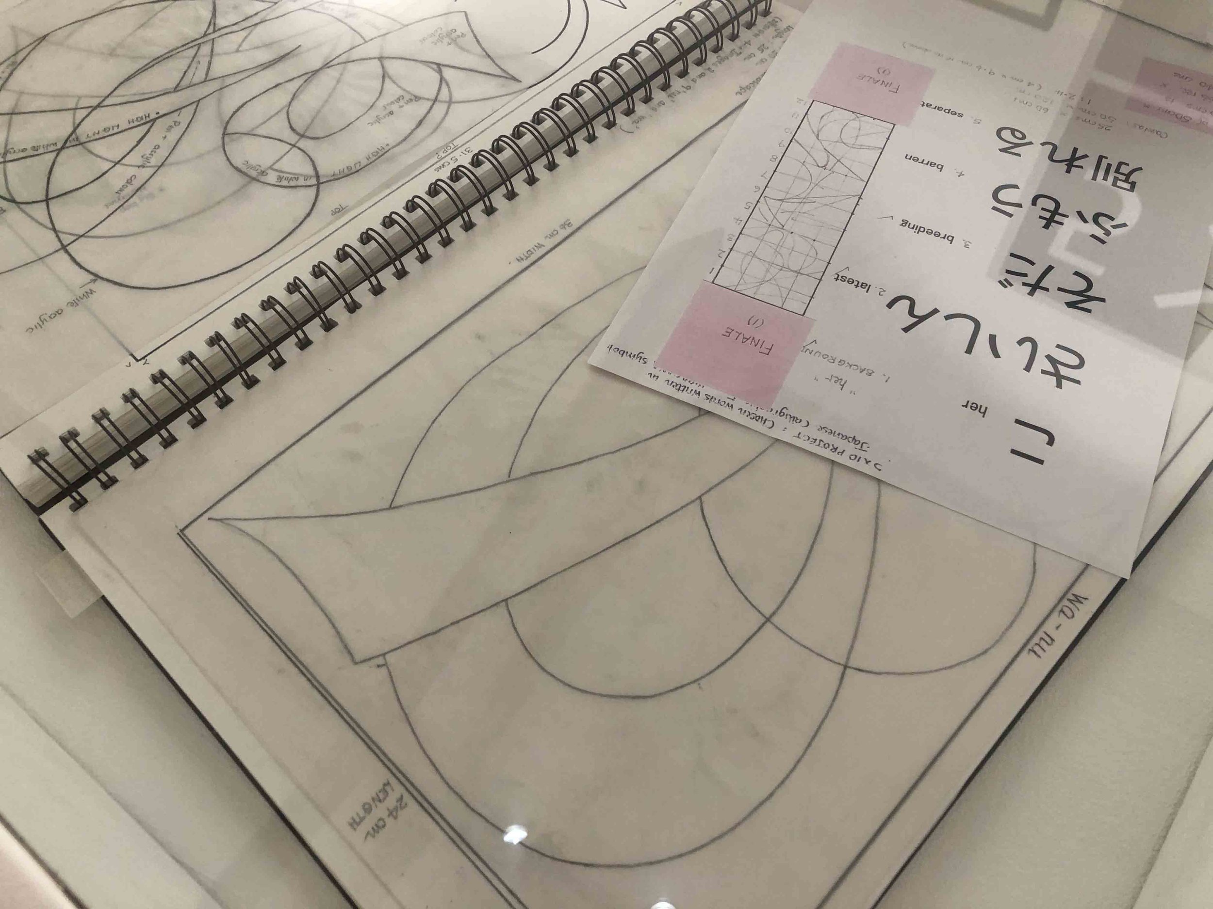
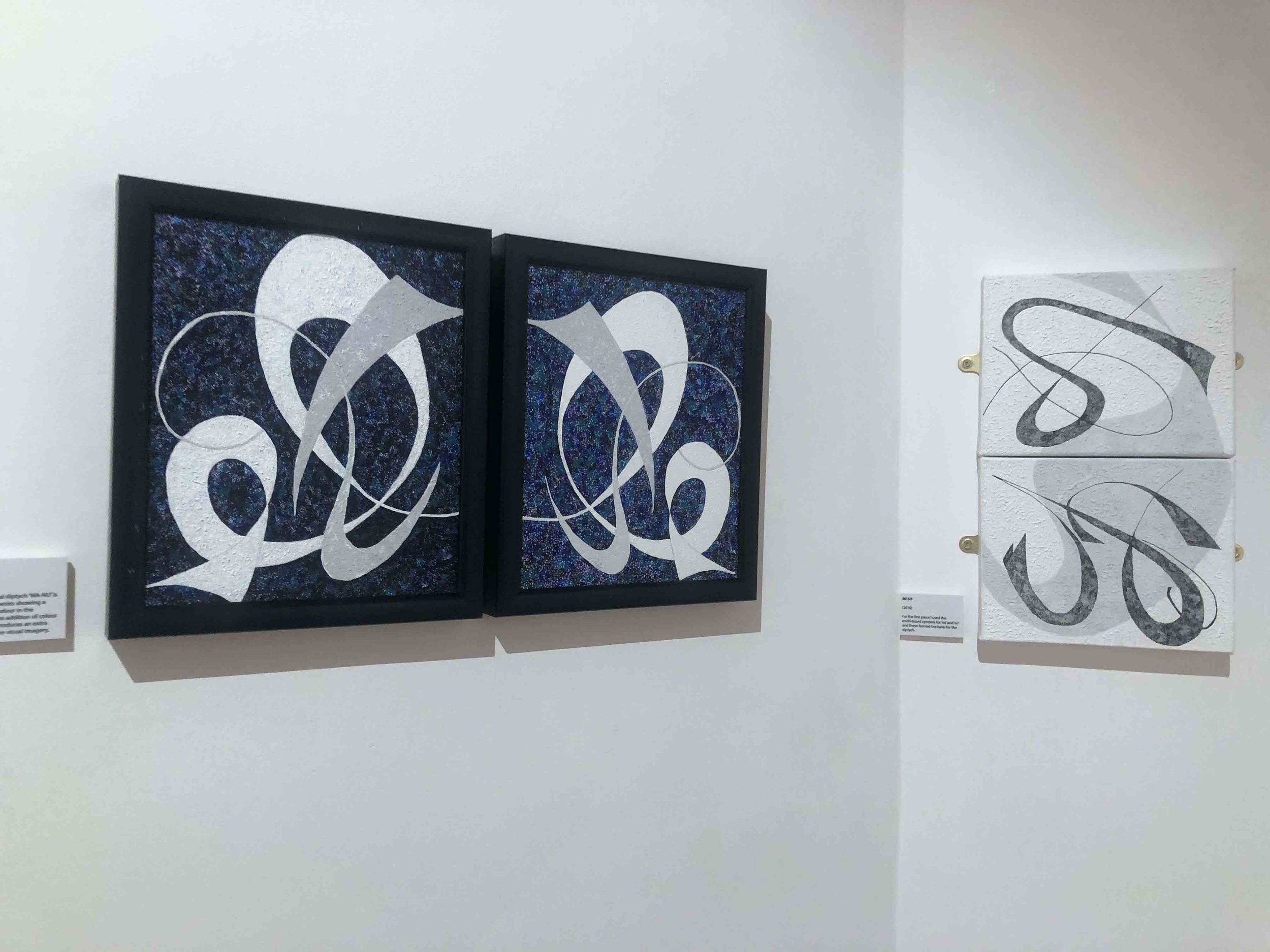
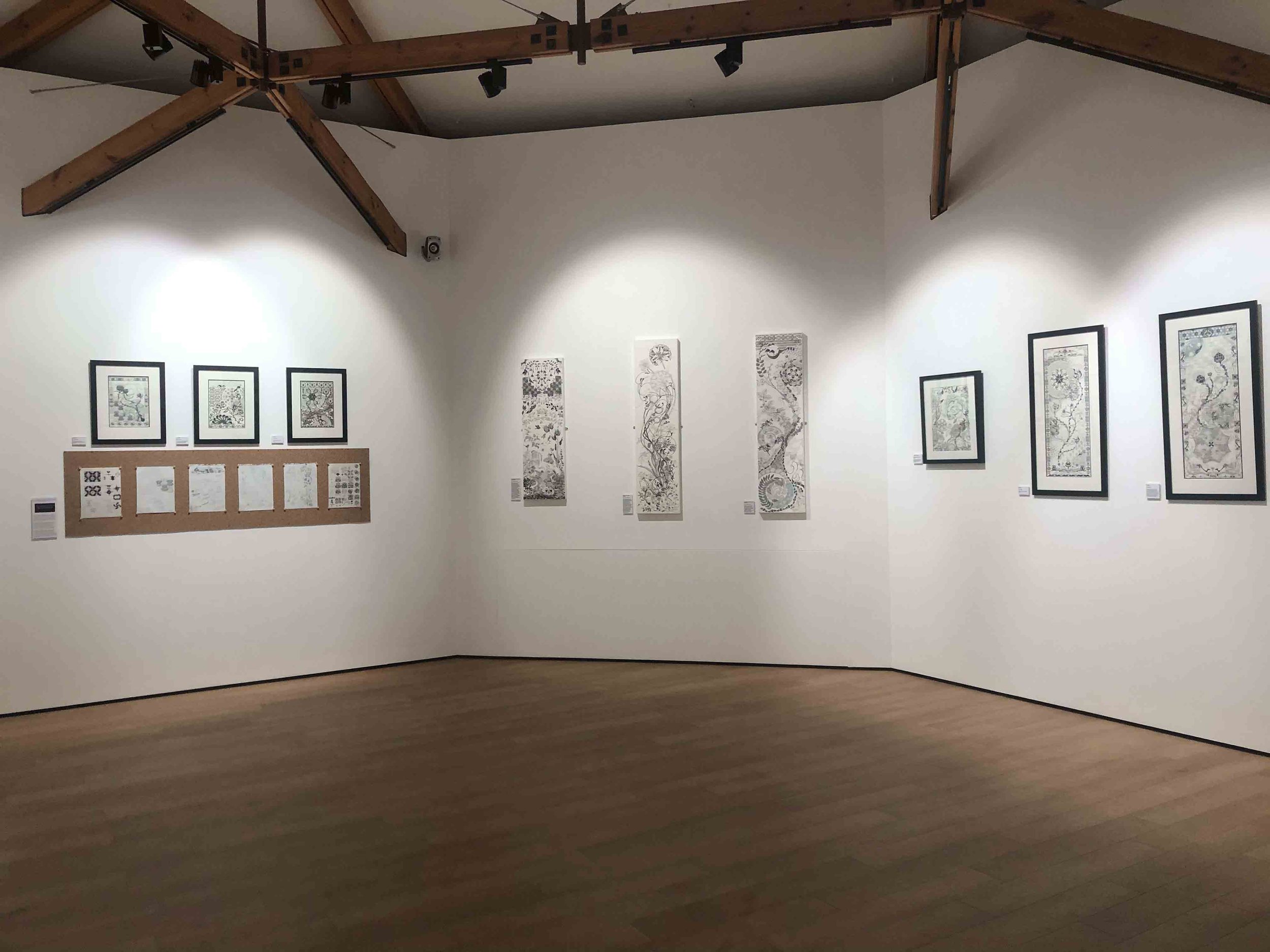
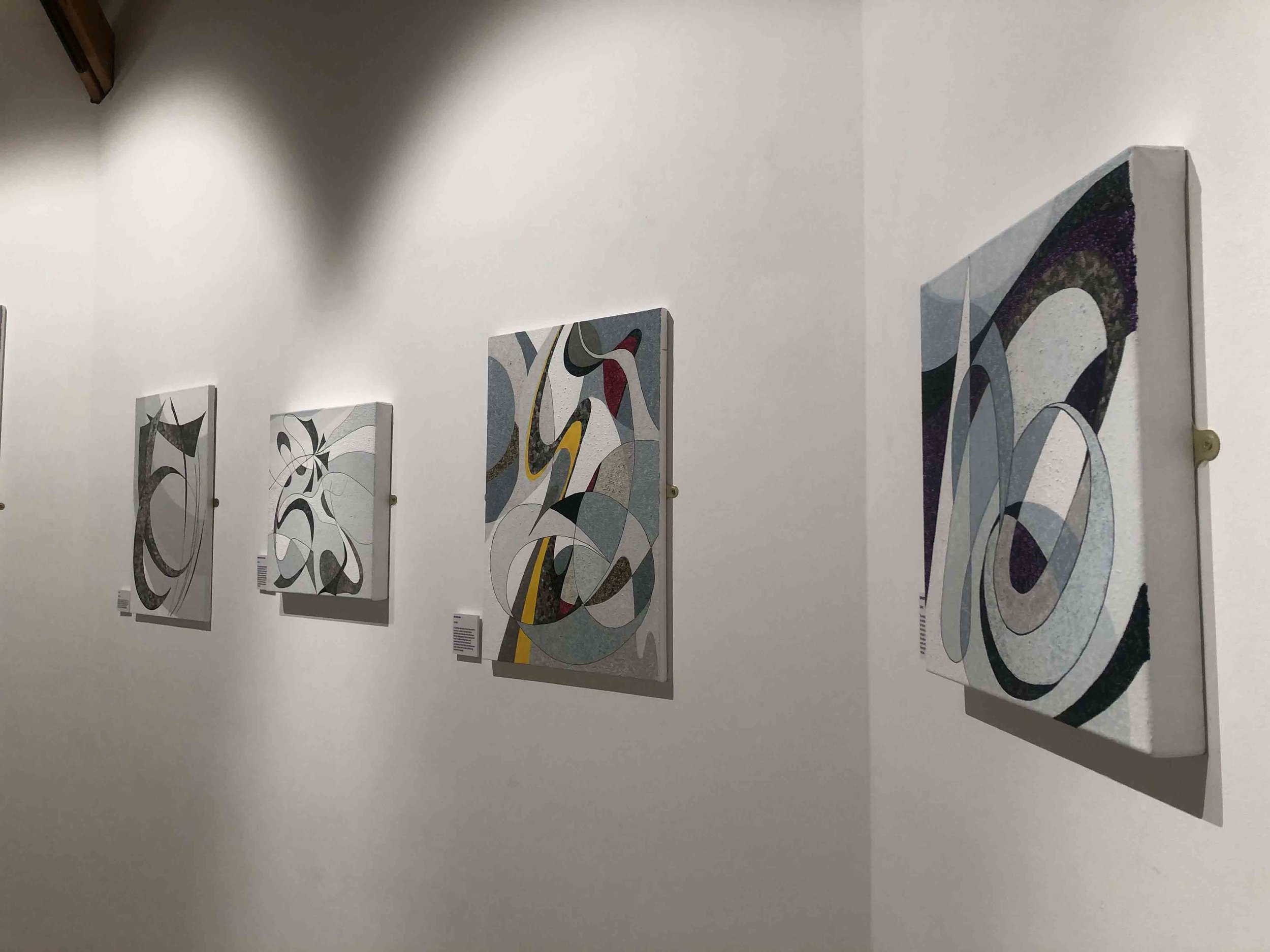
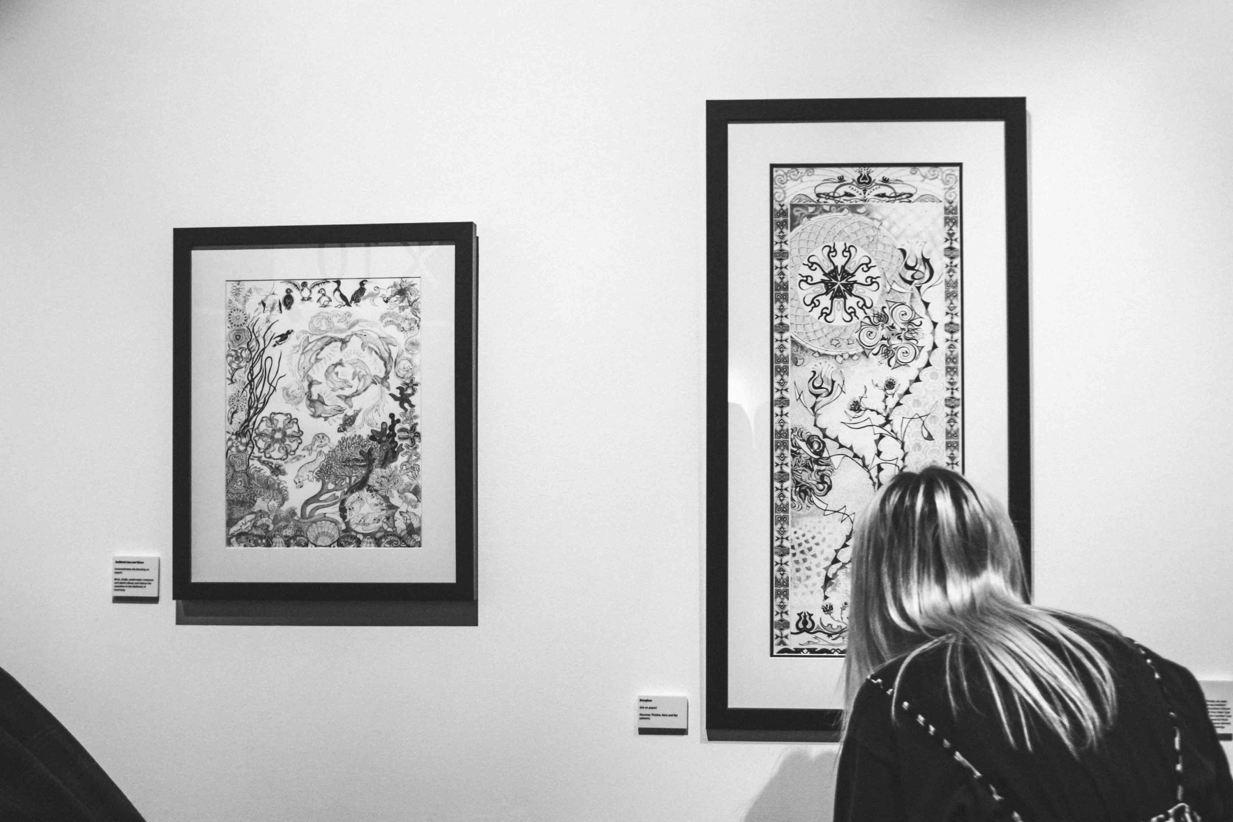
This series of work is entitled “JAPANESE CALLIGRAPHIC FORM”. All the designs are based on symbols from the Japanese HIRAGANA alphabet. However, the collaborative project “5 x 10” provided the motivation and development of the series. In 2015, having long been inspired by Japanese art and calligraphy, I was experimenting with the abstraction of Japanese characters from the Hiragana alphabet. This led to the first of my exhibition works which is a multi-board panel of ten abstracted Hiragana forms using a pen and ink pointillist technique.
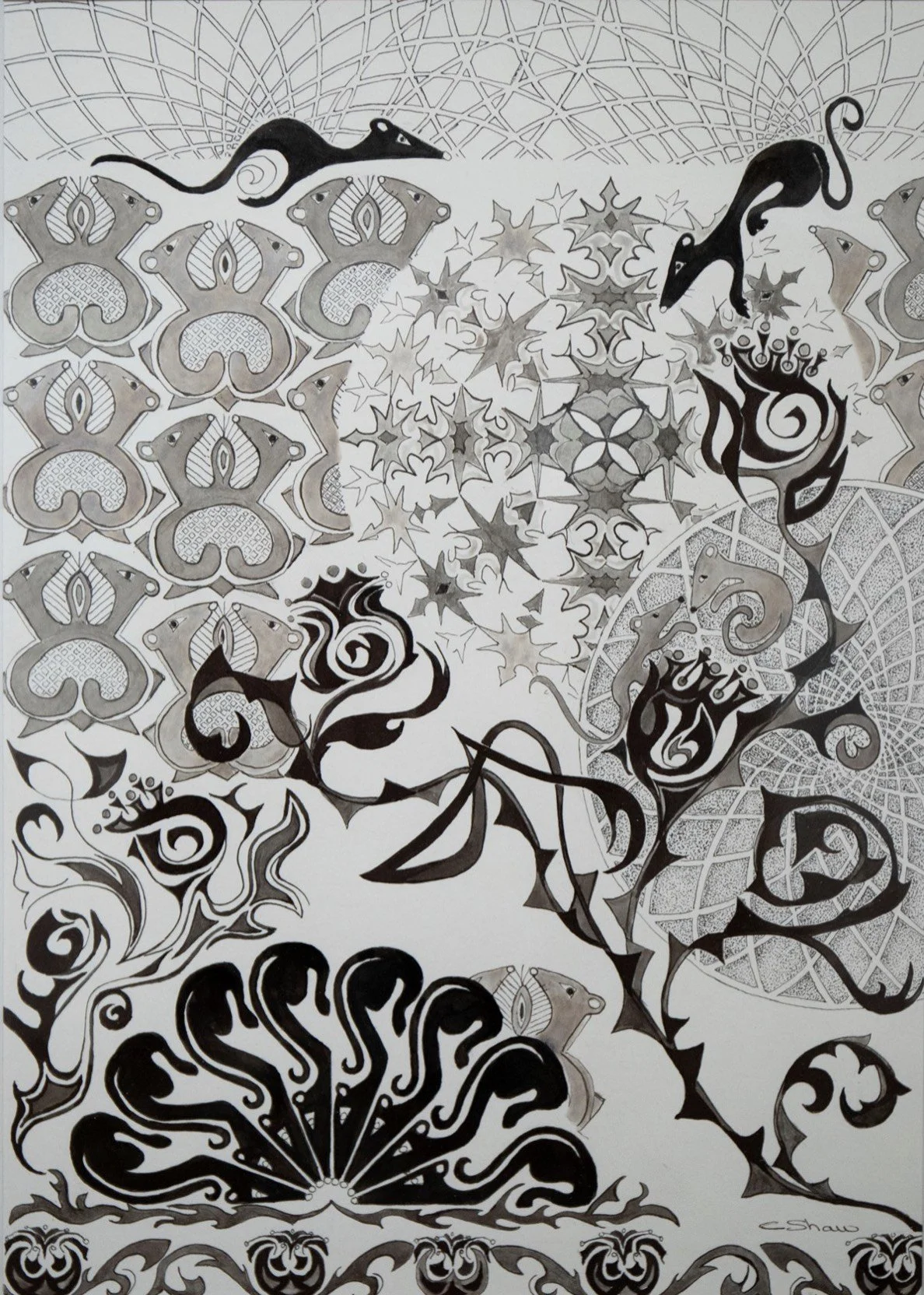
This was intended to be a ‘one-off ’ piece, but in 2016, in collaboration with Christine Shaw, we began the ‘5 x 10’ Project. The words that I generated by the set process were: her, latest, breeding, barren and separate. One of my early, but unresolved ideas was to use the word
‘barren’. I planned to create a central design of the word using Japanese Calligraphic characters. These would be surrounded by abstracted forms which would represent the result of the devastation caused by the 2011 Fukushima nuclear disaster in Japan. However, this exploration led to the revival of my fascination with Japanese calligraphic form and at this point I realised that I wanted to change direction and follow my instinct to further develop my work on the calligraphic forms of the Hiragana alphabet.
Previously, in 2006, my painting and drawing techniques had been severely affected by an injury that had reduced the strength of my left arm. As I am left-handed I was unable to hold a pencil, pen or paint brush in the normal way. I developed a method of painting by holding a barbeque skewer in an upright position in my left hand, whilst supporting it with my right hand. I was then able to apply the paint in small dots rather like stippling. Thus I established a painting technique that I have been using ever since. I also used this ‘stippling’ technique for the pen and ink work that features in most of the pieces in this exhibition.
The majority of the pieces have no bearing on realistic imagery. My work aims to communicate with the viewer through the beauty and simplicity of form, flow, movement and texture.


CHRISTINE SHAW

CHRISTINE SHAW cshaw@cwgsy.net
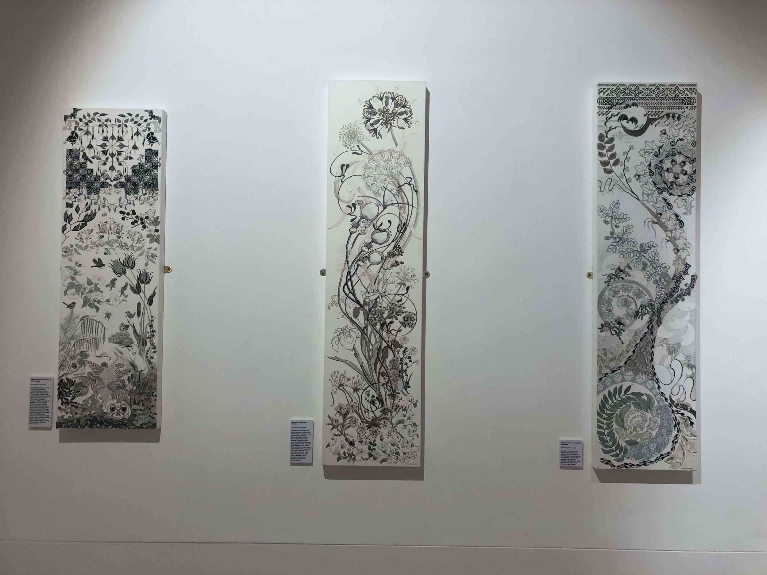
My recording of wild flowers had been ongoing for some time and I was now familiar with many species. Previous exploration of ink in 2015, provided the knowledge of pitfalls and advantages regarding the application of various types of text to a dérive canvas, with an acrylic paint base. I researched Scotland and Brecqhou at the library. I found the 10th book on the shelf for
‘Scotland’ (‘How the Scots Invented the Modern World’ by Arthur Herman) and as I did with the only book available for ‘Brecqhou’ on the Local Studies shelf, (‘A Very Private Island’ by Peter J. Rivett). Historical, legendary, and natural elements were noted:
In 1993 Brecqhou was bought by brothers Frederick and David Barclay, who also owned the ‘Scotsman’ newspaper. This link led to thoughts of symmetry hence the Celtic pattern which evolves from rotated images. Scottish research led me to the illuminated ‘Book of Kells’ and the Celtic patterns contained within it. This style inspired my entire project. The Book of Kells is a collection of illustrated religious manuscripts worked on by monks and begun on the Scottish island of Iona, then copied over the years by scribes. La Têne style of Celtic pattern is more closely relevant to the Bailiwick of Guernsey and nature. William Morris,
(who designed a window in St Stephens Church in Guernsey), was of Scottish parentage and was inspired by the Book of Kells and the Celtic influences that also led to Art Nouveau. Morris went on to create wallpaper designs using elements of nature in symmetrical patterns without losing their integral form.
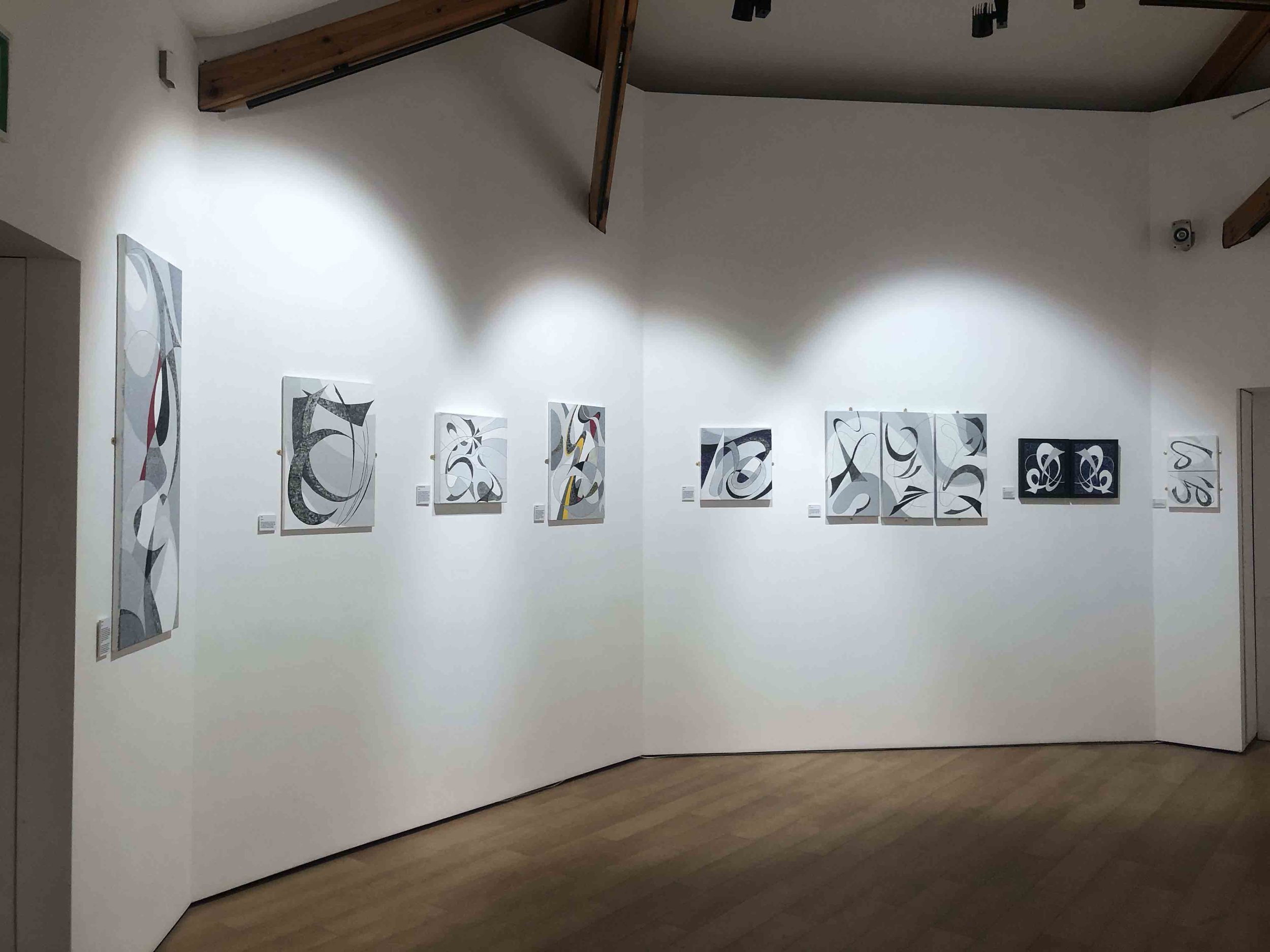
My earlier work on this project began primarily in the Celtic style with symmetrical patterns, but I too began to appreciate that nature’s own rich pattern was sometimes preferable and reverted to this. Some of the main features reflect the flowing lines of Art Nouveau, which was instrumental in the Celtic revival. I explored a new style of knot design by reinventing sketches of animals and birds which were later added to individual pieces. Some were taken further into abstraction and digital combinations as possible product design in the future.


Press

Download the exhibition catalog